PHOTOGRAPHERS USE ROLLOVER
- Oct 19, 2016
- 1 min read
Today on the Rollover FX blog, we take you on a tour of three gorgeous Photographer's websites. All three use Rollover pretty heavily, as a navigation tool.
Let's take a look:
SHANNON KORTMAN
http://www.shannonkphotography.com/
Shannon has used 2 different effects on her homepage. The main image uses the Lucie Effect. What' is interesting here is that Shannon has added a Wix text block over the Rollover app.
TAKESHI TSUCHIHASHI
http://www.takeshitsuchihashi.com/
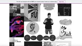
Tak has gone for the classic 3 column layout, with a minimal style. Using the Emily effect and keeping all the elements white, keeps the pure look and feel. After the splash page loads, this page acts as a hub for his three categories of work.
AD Studio
http://www.adstudio.co.il/
AD Studio has used the Lucie effect, leaving the default filter in place. It gives her photography a beautiful glow, creating a feeling of warmth and light.
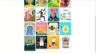
The layout is a 3 x 3 grid. On the mobile, the buttons are in one column.

So, those are our picks for today. Thanks for checking us out!






Comments