CUSTOMISING YOUR ROLLOVERS FOR MOBILE DEVICES
- Jul 12, 2018
- 1 min read
Did you know that you can change how rollover looks on mobile devices? We’ve done everything we can to ensure an incredible mobile experience. Define mobile specific elements of your site, customise fonts and widget size.
In this tutorial we show you how up can tidy up the look of your rollovers on mobile.
Key changeable features:
Design and Border tabs:
Mobile corner roundness – Give your rollovers smooth corners
Design and Fonts tabs:
Mobile heading size – Changes the font size for headings
Mobile paragraph size – Changes the font size for paragraphs
Mobile button size – Changes the font size on buttons (not in our video as we weren’t using them )
Layout tab:
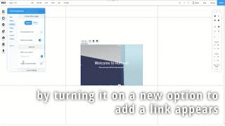
Mobile text and button alignment – Alter the position of your text
The border and font settings apply to both the start state and end states whereas with the text layout can have it switch between states.
In the mobile view it’s also possible to alter positions and sizing’s as you want without affecting the desktop view. Just enjoy playing around with the settings to get the style that you desire!
If you’d like some more handy tips on using Rollover check out our Tutorial Videos. If you’d like to add our Rollover app to your site, check out Rollover Image Effects on the Wix Market.
Want to know more about our app? Have you played with these features before or have an ideas for new features? We’d love to hear from you! Why not drop us a comment below and let us know!

Comments